

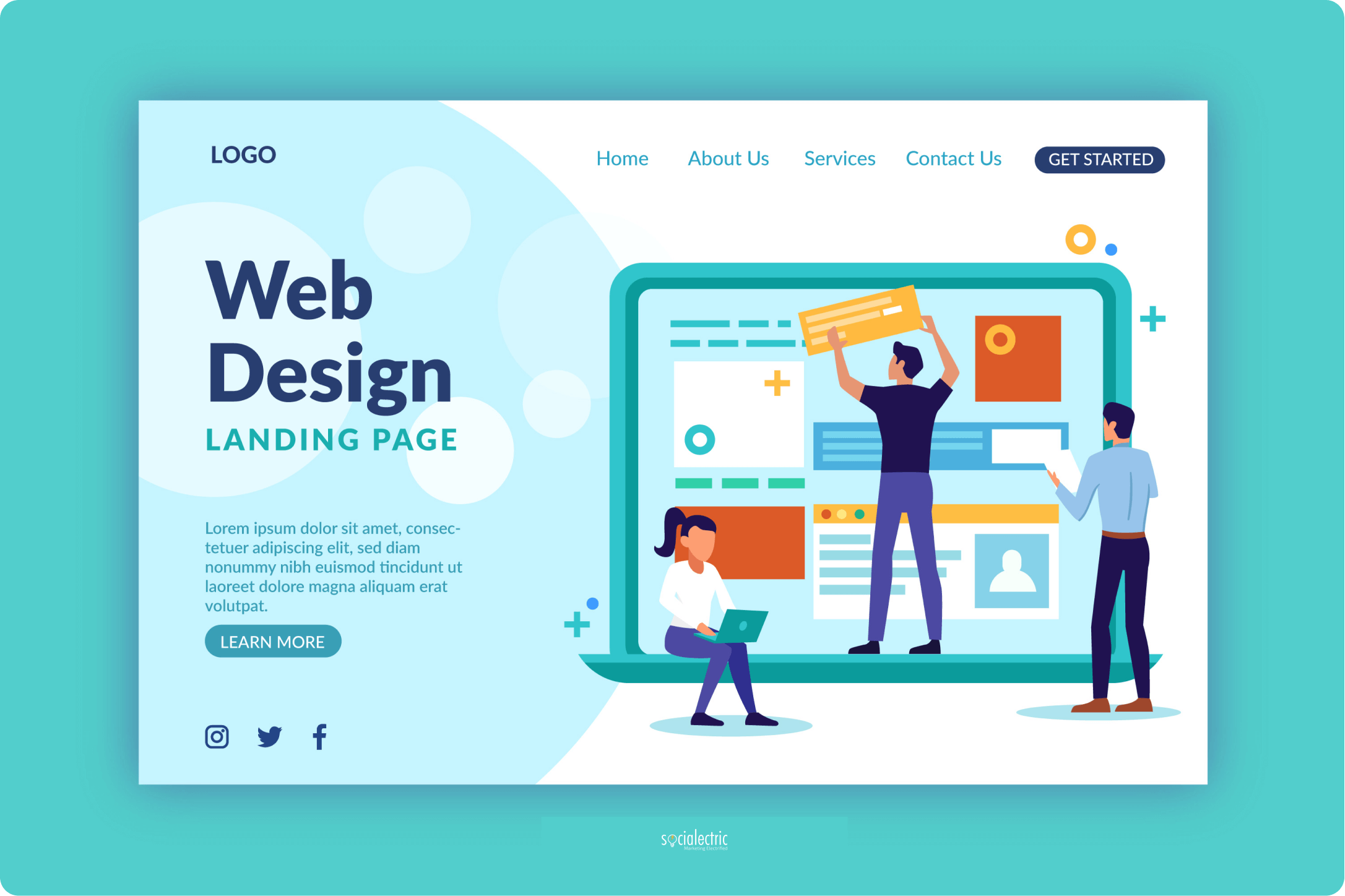
Homepage Website Layout: The Most Essential Guide Every Beginner Have to Read
The homepage website layout is the very first thing your users see. The better you do on your homepage, the more users you can convince. But where to start? What is the key tactic every homepage website layout must-have? Is there any tip to apply instantly for homepage layout?

The homepage website layout is the first thing a user sees when clicking through a search result or a link. This is your chance to create the first impression with your potential customers, and you should make it right every time. One-click leads to the first time someone sees your brand, product, or services, and you only have a maximum of 5 seconds to impress them. That’s why you need the best homepage layout you could.
We find it extremely worthy to have a welcoming, clear, and creative homepage website layout. Not only to introduce your brand and services, but you also need to invite people to learn more and convince them to buy from you. Therefore, both business owners and designers need to have the right mindset about web design. In today’s blog, we’ll tackle everything you need to know about homepage website layout. From key features to all the how-to’s you’ll need, it’s all right here!
8 Key features of every homepage website layout
Within a few seconds, your homepage has to show all of its importance and encourage users to keep on reading. That’s why we always recommend some key features that every homepage website layout should include.
1. Logo & branding elements
Never underestimate the power of branding. How many brands could you name just by looking at their logo? Pretty impressive right? A logo is the core feature of every brand’s identity, so why not put it on your website?

If you can recall, almost every website you visit has a logo on its navigation bar or header. Most of them are placed on the top left since that’s the hot spot of users' behavior. People will look there first, so let them know whose homepage they’re visiting without looking at the address bar. Keep it easy to spot, small enough to don’t overwhelm the rest of your homepage, yet big enough for visitors to see.
2. Navigation
As we’re going top to bottom of every website, all the best homepage layouts have one thing in common. It’s their navigation bar. It must be right on your header for easy access. Thus, adding a search bar would be much more convenient for your users to get what they want. But adding a navigation bar is not just it. You have to make it become a roadmap, a journey guide to your users. The better you do at this point, the more likely you can improve your bounce rate.

3. Above the fold optimization
Which we’d normally call the above-the-fold optimization. This part often comes right under the navigation bar, with a large image or graphic and a tagline. Or even, in other words, it’s everything users see when they first land on a webpage. It might look simple, but in fact, this is where your homepage website layout creates the strongest impression to visitors. You can take huge advantage of above-the-fold SEO, and turn it into your strength.

Right at this spot, you might have met many brands and companies using it for their visual/ aesthetic purpose only. Trust us, don’t waste the golden spot for that.
Above-the-fold optimization is where you are supposed to put your tagline on, and show the world what you do (or sell). Give them the information they need, show them what you got. If you’re placing anything else rather than your headline or a strong statement right above the fold SEO, you’ll probably need a change.
4. Call to action
Every website has its goal, and mostly it’s some kind of conversion. No matter you’re aiming at email subscription, purchase, or newsletter sign-up, a tempting Call to action is always useful. Well, your users won’t be playing hard to get, if you want them to do anything, just tell them. Give them something to focus on, like a button, a link, or something that stands out from your normal content.

When it comes to call to action, for example, for newsletter sign up, you must either be clear about the message first, then think of how to make it pop. Contrasting colors, fonts, boldness is the most common ways to highlight your call to action.
However, we have a little note for you. Don’t overuse Call to action. Be clear with your goal and stick with it. Choose where you’d place it wisely, or your user could scroll right through it without noticing.
5. Social proof – testimonials
Think of it as if you’ve just met someone. If they just come to you and keep telling you about what they achieve through life, would you believe them? Or would you have more trust and positive impression when hearing someone else praising them? The same logic happens with your brand and business. Just allow testimonials or social proof to speak for your quality!

Never hesitate when it comes to testimonials, it’s the best advice we’ve always said to our clients. You need to show off yourself, but through other people’s world to create that lovely, trustworthy first impression! Thus, don’t worry about negative social proof. Let people see that you have mistakes, and you’re always ready to make it up. In that way, your visitors will understand that you care about their experience, and will do your best for them.
6. Photography
Most website sections will consist of visuals and photos. You’ll be more likely to have photos on your homepage website layout than anywhere else. When you use images, remember this one rule: never use photos as filler. Every image you put onto your homepage layout must align with your brand guideline & identity. This means those photos must match your brand’s tone & mood, to serve its communication purpose. So our best advice is always to use real images of your brand and stay away from stock photos. It’d be great if you could make a showcase of your photo gallery as well.

Having many high-quality images on your site could slow down the loading speed. However, you can always optimize them to make sure your site will load nicely.
7. Content

People have always said that content is king, and it’s true. Every angle of your website must include content. Right on the homepage website layout, you will meet content that serves user experience purposes. At this part of a webpage, all content & information should be kept short and sweet. As long as it’s easy to read, eye-catching, and fascinating, your audiences will be more likely to stay and keep scrolling. When working on content for the homepage website layout, don’t forget to be consistent with your brand voice on other media channels. Other than that, you’ll confuse your visitors.
8. Footer
Last but definitely not least, the best homepage layout can’t be done without a proper footer. This is the space for you to leave all your media handles, contact information, and a mini sitemap here. Leaving your contact info visibly on the footer will encourage users to reach out to you when they’re in need. Thus, this somehow provides the feeling of safety and trust since visitors know they can contact you right away.

Linking to the social media handle shouldn’t be put anywhere else but on the footer. That way, visitors can still catch up with your social media if they’re interested, yet won’t affect your site’s bounce rate. A mini sitemap will encourage users to check out other parts of your page, and for quick navigation. Those small things are always helpful and would help to improve the on-page user experience dramatically.
5 useful tips for homepage website layout
Once you’ve understood all the main features to secure a good homepage layout, it’s time to get your hands dirty. We know it’s still not easy to start working on your homepage website layout yet. So here are our 5 tips for you to keep the work smoother.
1. Simple, clutter-free, and focus homepage:

Like we’ve said above, your homepage must speak for your brand’s ideal and identity. People rarely read every word of your page, but they’ll scan for important information. To help them with the scanning process, so that they can catch up faster with your site’s info, keep your design simple. Yes, you’re not hearing it wrong. You can still be creative and insane the way your brand is, but make it simple and easy to read on the website. Here are some hacks you can use right on your homepage for a clutter-free and smooth experience:
- Keep all important content right above the fold: let visitors know who you are right when they land on your page without any hesitation.
- Use more white space: Give them a little rest, your layout will feel more spacious and balanced. Don’t shove huge chunks of text, split them out and give your audience little by little.
- Add visual: Like humans, we all love to see images, no matter their photography or graphics. All will do the job of catching users’ attention and communicate your message.
- Never forget a call to action: Place a button, and ask them to do what you want. But remember, don’t overuse. That’ll be really annoying to see.
2. Have a clear visual hierarchy with your homepage website layout:
Every designer knows the importance of visual hierarchy since it’s the first thing they learned about design. Those strict principles help showcase your content and visuals more effectively. And from that, you’ll be able to lead users’ attention to certain placement to serve your needs.

Creating a good visual hierarchy is like leaving breadcrumbs on the floor for the mice to follow. Users will unconsciously be picking up those crumbs you leave them and keep following your through pages once you’ve got their attention in the first place. Some components you should optimize will include the size and weight of your fonts and text, thus elements/ button placement.
3. Life is too fast for hard-to-read text:

Keep your readability score high, and your users will be truly thankful for that. Forget all the big words, when it comes to content you should keep it as simple as possible. Users by then will effortlessly scan through your content to pick up what they need. To achieve the best of readability, try to create contrast between the background and your text color. Enlarge your font sizes, choose a simple font, and use no more than 3 on your homepage will also help.
Just remember this, if you’re lazy to read sometimes or most of the time, then your users are just the same. So why not make their experience on your page much easier with simple content?
4. Easy navigation:

It seems like we’re trying to make users think less and scroll more, but that’s the key to the best homepage layout. The more they try to think, the higher chance they’ll leave your site. Don’t try to be sophisticated or break the rules on your navigation bar, it’ll only harm you. Users want easy access to what they need, not a complicated bar that will move them somewhere they don’t know. For easier navigation, you can try these out:
- Link your logo to your home page: an old trick but always useful. Thus it helps users moving back to the homepage much easier than clicking “back” a few times.
- Simplify your options: Don’t leave your visitor thinking what would happen if they click here or there. Make it clear, let them know what’s waiting for them.
- Never forget footer information: As we’ve said above, footer content will help it much easier to contact and navigate between pages.
5. Be mobile-friendly:

Most of your site visitors are now using mobile devices. If you’re not optimizing your site according to users' needs, they’ll jump right out and head for another site. When designing your homepage website layout, always remember to create a mobile-friendly version as well. Hence, when you’re on a mobile device, be clearer and even less cluttered than on your desktop. Trust us, your users will love that!


